Design Library
Brand tokens, type specimens, UI components, and accessibility guidelines for Tee's Flooring — Columbus metro's craftsman flooring specialists.
Logo Suite
All approved logo files for Tee's Flooring — primary variants, favicons, and social assets. Use the toggle to preview on light or dark backgrounds. Download buttons link directly to the source files.
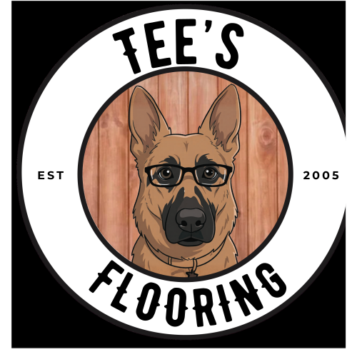
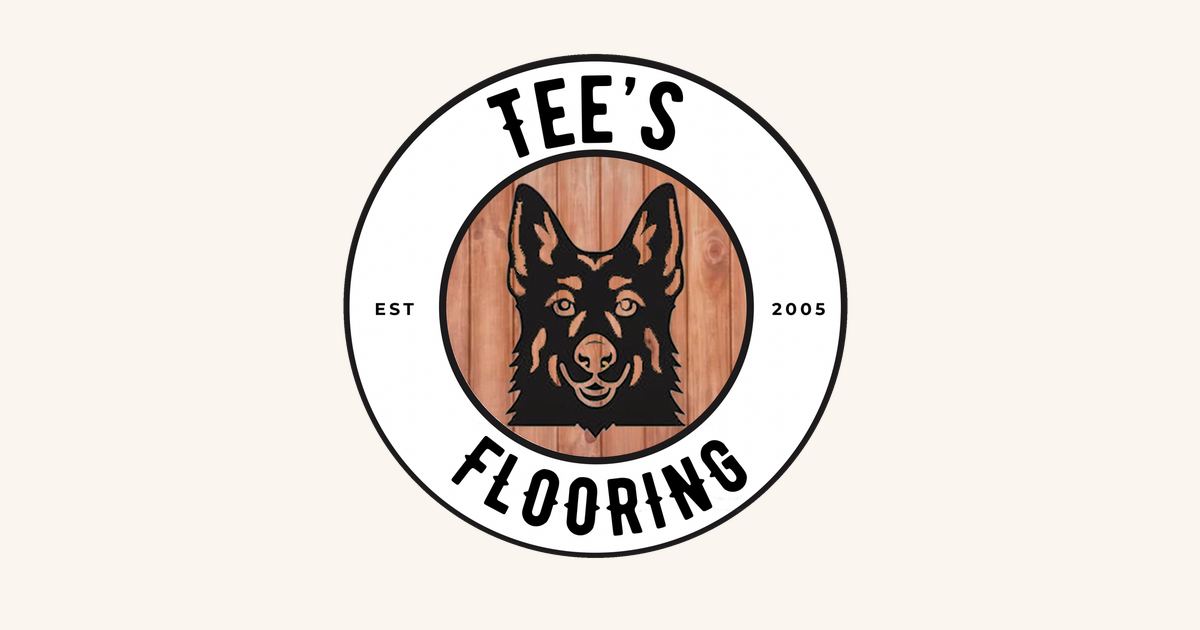
Primary Logo
The full logo — Reno badge, "Tee's", and "FLOORING." Default for all website, proposal, and marketing use.


Clear Space & Minimum Size
Always leave clear space equal to the height of the inner Reno circle around the seal. Never lock text, borders, or other logos inside that zone. The seal toggles with the preview mode above.
Brandmark
The Reno circle — no text ring. For watermarks, small placements, app icons, and merchandise.

Horizontal Lockup
Brandmark left, wordmark right. For headers, email signatures, invoices, and wide horizontal placements.

Wordmark
"Tee's FLOORING" in brand typography — no icon. For footers, invoices, email signatures, and tight horizontal spaces.
Monogram & Badge
"TF" lettermark — standalone and in a circle badge. For favicons, social avatars, watermarks, and small placements.






Favicon Set
Browser tabs, app icons, and Apple touch icons. All generated from the primary logo.


Social Assets
Pre-sized for Instagram, Facebook, Google Business, and link preview cards.
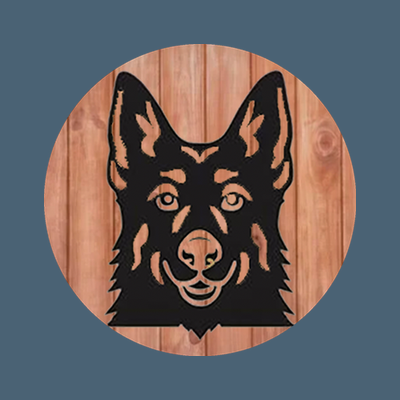











Inspector Reno — "Inspector Approved" Badge
Tee's brand mascot badge. Used as a trust signal on service pages, testimonials, and before/after showcases.
File Reference
All logo files organized by variant.
logos/brandmark/ — brandmark-color/dark/white/on-slate .svg + (128/250/500/1000).png
logos/horizontal/ — horizontal-color/dark/white/on-slate .svg + (300w/600w/1200w).png
logos/wordmark/ — wordmark-color/dark/white/on-slate .svg + (250w/500w/1000w).png
logos/monogram/ — monogram-color/white/on-slate (128/250/500).png
logos/monogram-badge/ — monogram-badge-color/white/dark (128/250/500).png
logos/favicon/ — favicon.svg, favicon.ico, favicon-(16/32/48/180/192/512).png
logos/social/ — profile-400.png, profile-200.png, instagram-320.png, og-1200x630.png, twitter-1500x500.png
Color Palette
Slate Blue as primary, warm sandstone as the anchor — earthy, craftsman, trustworthy. Every color has a specific role in the system.
Color Combinations
Recommended text-on-background pairings for sections, cards, and components.
Your Home.
Color Usage Rules
Every color has a role. These rules keep the palette consistent across the whole experience and prevent off-brand drift.
Type System
Three typefaces: Playfair Display for character and warmth, Inter for clarity and readability, Montserrat for bold CTAs that drive action.
Use for: the logo mark only — primary lockup, horizontal lockup, monogram, brand hero callouts
Character: Vintage display serif, craftsman heritage — the voice of the brand mark itself. Never use in body copy or UI.
Your Home. Our Craft.
Use for: H1–H4, section titles, blockquotes, testimonial pull quotes, hero headlines
Character: Warm, editorial, craftsman — evokes heritage and quality without feeling old-fashioned
Use for: body copy, form labels, navigation, captions, metadata, UI components
Character: Neutral, highly readable at all sizes — keeps content scannable and professional
Use for: button labels, CTAs, badge text, eyebrow labels, strong UI copy that drives action
Character: Bold, confident, action-oriented — makes CTAs feel intentional without being pushy
Type Scale
Fluid type scale from caption to hero. Use these sizes consistently to maintain visual hierarchy.
| Token | Size | Weight | Line Height | Font | Usage |
|---|---|---|---|---|---|
| --font-hero | Tee's Flooring | 400 | 1.05 | Bernier | Brand mark only — hero wordmark, logo lockups |
| --text-hero | 4rem / 64px | 400–700 | 1.1 | Playfair Display | Hero headlines, landing page H1 |
| --text-section | 2.5rem / 40px | 400–600 | 1.2 | Playfair Display | Section titles, page H2 |
| --text-card | 1.5rem / 24px | 400–600 | 1.3 | Playfair Display | Card titles, H3, subsections |
| --text-body | 1.125rem / 18px | 400–500 | 1.75 | Inter | Body paragraphs, descriptions |
| --text-small | 0.875rem / 14px | 400–600 | 1.6 | Inter | Captions, metadata, helper text |
| --text-label | 0.75rem / 12px | 600–700 | 1.4 | Inter / Montserrat | Eyebrows, tags, UI labels |
Font Pairing Rules
Three fonts do specific jobs. Never swap their roles — the whole system depends on consistent pairing.
Brand Voice
Tee's Flooring speaks like a master craftsman — warm, knowledgeable, and honest. Never corporate. Never cheap.
Sample Copy in Brand Voice
We're not a big-box store. We're Tee's Flooring — a family-owned business that's been transforming Central Ohio homes since 2005. We bring the showroom to your living room, install with care, and stand behind every square foot.
LVT that holds up to real life. Hardwood that ages beautifully. Carpet that actually feels good underfoot. Tile that makes your kitchen look like it was designed for it. We handle all four — and we do them well.
Do's & Don'ts
- "We come to you — free in-home samples"
- "20+ years serving Columbus metro"
- "Free estimates, no pressure"
- "LVT, hardwood, carpet, and tile — done right"
- "Your floor, your home, your call"
- "Inspector Reno gives it two paws up 🐾"
- "Luxury flooring solutions for discerning customers"
- "Unbeatable pricing on premium products"
- "Industry-leading synergy and flooring excellence"
- "Our team of experts are standing by"
- "Transform your space with our wide selection"
- Exclamation marks on every sentence!!!
Heading Scale
H1 through H6 — all using Playfair Display. Each level serves a specific structural role in the content hierarchy.
Playfair Display
Your Floor, Your Home.
Playfair Display
Our Flooring Services
Playfair Display
Luxury Vinyl Tile (LVT)
Playfair Display
Installation & Subfloor Prep
Inter (Montserrat)
Service Areas & Pricing
Inter — uppercase
Columbus Metro · Johnstown · New Albany
Paragraph Styles
Four text roles for body content — from lead intro paragraphs to fine-print captions.
Inter
line-height: 1.65
We bring the showroom to you. Schedule a free in-home consultation and choose from hundreds of flooring samples — all in the context of your actual space, your lighting, your furniture.
Inter
line-height: 1.75
From LVT that stands up to kids and pets, to engineered hardwood that adds lasting value to your home — we stock the products that Central Ohio families actually love. Every installation includes subfloor assessment, proper acclimation, and a walkthrough with you before we leave.
Inter
line-height: 1.6
Serving the Columbus metro area including Johnstown, Newark, Westerville, New Albany, and surrounding communities. Free estimates valid for 30 days. Installation timelines vary by project scope and material availability.
Inter
line-height: 1.5
Before/After: LVT installation, Westerville OH — completed in 2 days. Material: COREtec Pro Plus Enhanced. ©2026 Tee's Flooring LLC
Link Styles
Four link types for different contexts — all slate-blue-based to maintain brand cohesion.
Article Block
Full composed content block — headings, body, lists, blockquotes, and links all styled in brand.
LVT vs. Hardwood: Choosing the Right Floor for Your Central Ohio Home
Every home is different — and so is every floor. After 20 years installing flooring across Columbus, Johnstown, and the surrounding communities, we've developed strong opinions about what works. Here's our honest take on two of the most popular choices.
Luxury Vinyl Tile (LVT) — The Practical Champion
LVT has come a long way. Today's products are nearly indistinguishable from real wood or stone, and they outperform both in a number of real-world scenarios:
- 100% waterproof — ideal for kitchens, bathrooms, and basements
- Stands up to pets, kids, and high foot traffic
- Floats over most existing floors — reducing demolition costs
- Excellent for Central Ohio's temperature swings (it won't cup or warp)
"We replaced our entire first floor with LVT and it transformed the house. Tee walked us through every option and didn't oversell us on anything we didn't need."
— Sarah M., Westerville OH · LVT Installation 2024
Hardwood — When Nothing Else Will Do
For buyers who want genuine hardwood, we respect that choice. Real wood adds character, warmth, and provable resale value. It requires more care — proper acclimation, subfloor prep, humidity control — but done right, it lasts generations.
- Choose engineered hardwood for most Central Ohio conditions (better moisture stability)
- Allow 72 hours of acclimation before installation begins
- Maintain 35–55% relative humidity year-round for longevity
Not sure which is right for your project? Book a free in-home estimate and we'll bring samples for both so you can see them in your actual space.
Form Components
Contact and estimate request forms styled in Tee's brand. Slate blue focus rings, warm borders, craftsman-quality feel.
Input States
🐾 Inspector Reno approved — no spam, ever.
Icon Library
Curated from Google Material Icons Outlined. Organized by function for the Tee's Flooring context.
Spacing Scale
8-point base spacing system. Sandstone bars indicate scale. Bars pulse slate on hover.
Component Previews
Key page components in Tee's Flooring brand. These represent recurring patterns used across the website.
Trust Bar
Used at the top or bottom of hero sections to establish credibility immediately.
Navigation Bar
Primary site nav. Logo lockup left, links center-right, CTA button far right.
Hero Section
Charcoal-to-slate gradient hero. Display font headline, slate blue CTA, trust bar below.
Your Floor.
Your Home.
Our Craft.
LVT • Hardwood • Carpet • Ceramic Tile — We bring the samples to you and install with precision.
Service Cards
Product/service preview cards. Amber gradient header, icon, title, description, pricing range.
Testimonial Card
Customer review card with amber stars, quote, and Inspector Reno badge.
"Tee's crew showed up on time, kept the house clean, and the LVT looks incredible. Our dog approves — and so does Inspector Reno."
"We've used Tee's for three houses now. Honest pricing, no upselling, and the hardwood in our dining room is stunning. They're who we recommend."
Before / After Showcase
Side-by-side transformation reveal — used in gallery and case study sections.
Inspector Reno Badge Variants
Reno is the brand mascot — a dog who "inspects" every job. Use these badges as trust stamps across the site.
Accessibility
All text/background combinations meet WCAG 2.1 AA minimum contrast (4.5:1 for normal text, 3:1 for large text). Amber focus rings at 3px on all interactive elements.
| Text Color | Background | Preview | Ratio | Level |
|---|---|---|---|---|
Charcoal #2C2C2C |
Warm Sandstone White #FAF6EF |
Body Copy |
14.5:1 | AAA |
Charcoal #2C2C2C |
Sandstone Surface #EDE7DB |
Card Text |
12.6:1 | AAA |
White #FFFFFF |
Charcoal #2C2C2C |
Dark Section |
16.1:1 | AAA |
White #FFFFFF |
Slate Blue #4A6274 |
CTA Button |
5.1:1 | AA |
White #FFFFFF |
Deep Slate #354856 |
Hover State |
7.5:1 | AAA |
Slate Blue #4A6274 |
Warm Sandstone White #FAF6EF |
Headings |
4.9:1 | AA |
Deep Amber #8E5A18 |
Warm Sandstone White #FAF6EF |
Accent Text |
5.4:1 | AA |
White #FFFFFF |
Rich Brown #6E4412 |
Badge / Reno |
8.4:1 | AAA |
Rich Brown #6E4412 |
Warm Sandstone White #FAF6EF |
Craft Text |
7.9:1 | AAA |
Text Light #6B6B6B |
Warm Sandstone White #FAF6EF |
Captions |
4.6:1 | AA |
Focus States
All interactive elements use a 3px slate blue focus ring. Tab through the page to see them in action.
outline: 3px solid rgba(74,98,116,0.6) and outline-offset: 2px on :focus-visible. Never use outline:none without a custom replacement.
CSS Variables
Copy-paste ready — these tokens power the entire Tee's Flooring design system
/* ===== Tee's Flooring Design Tokens ===== */
:root {
  /* Colors */
  --color-primary:       #4A6274;   /* Slate Blue — buttons, CTAs, headings, active states */
  --color-primary-dark:  #354856;   /* Deep Slate — hover states, pressed */
  --color-secondary:     #8E5A18;   /* Deep Amber — warm accent, used sparingly */
  --color-accent:        #6E4412;   /* Rich Brown — Reno, craft warmth, badges */
  --color-accent-dark:   #5A3A0E;   /* Dark Brown — deep accent states */
  --color-text:          #2C2C2C;   /* Charcoal — body copy, headings */
  --color-text-light:    #6B6B6B;   /* Muted — captions, metadata */
  --color-bg:            #FAF6EF;   /* Warm Sandstone White — page canvas */
  --color-surface:       #EDE7DB;   /* Sandstone Surface — cards, panels */
  --color-border:        #E5E0D8;   /* Light Gray — dividers, form borders */
  --color-sandstone:     #D4C5A9;   /* Sandstone — warm fills, card accents */
  --color-sage:          #7A8B6F;   /* Sage Green — success, secondary decorative */

  /* Typography */
  --font-display: 'Playfair Display', Georgia, serif;  /* Headlines, section titles */
  --font-body:    'Inter', system-ui, sans-serif;        /* Body, UI, forms */
  --font-cta:     'Montserrat', var(--font-body);        /* Buttons, badges, CTAs */
  --font-mono:    'SF Mono', 'Fira Code', monospace;     /* Code, tokens */

  /* Type Scale */
  --text-hero:    4rem;       /* 64px — hero headlines */
  --text-section: 2.5rem;     /* 40px — section H2s */
  --text-card:    1.5rem;     /* 24px — card titles, H3s */
  --text-body:    1.125rem;   /* 18px — body paragraphs */
  --text-small:   0.875rem;   /* 14px — captions, metadata */
  --text-label:   0.75rem;    /* 12px — eyebrow labels, UI tags */

  /* Spacing */
  --space-section:   80px;   /* between major page sections */
  --space-card:      32px;   /* card internal padding */
  --space-grid:      24px;   /* grid gaps, card grids */
  --space-component: 16px;   /* inline UI element spacing */

  /* Border Radius */
  --radius-sm:   6px;     /* tags, small elements */
  --radius-md:   10px;    /* inputs, small cards */
  --radius-lg:   16px;    /* cards, section containers */
  --radius-full: 9999px;  /* pills, chips, buttons */

  /* Shadows */
  --shadow-subtle: 0 1px 4px rgba(0,0,0,0.06), 0 2px 10px rgba(0,0,0,0.04);
  --shadow-medium: 0 4px 16px rgba(0,0,0,0.10), 0 1px 4px rgba(0,0,0,0.06);
  --shadow-strong: 0 8px 32px rgba(0,0,0,0.14), 0 2px 8px rgba(0,0,0,0.08);
}